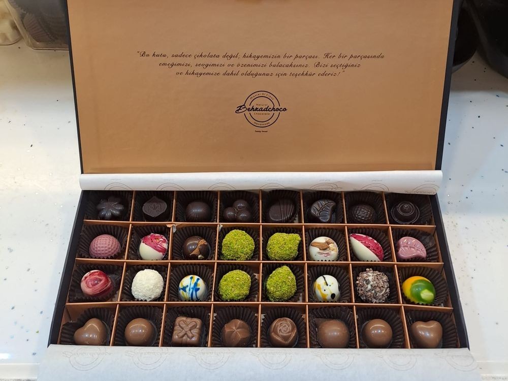
03 / Independent client work / İzmir
Make the product feel crafted before the visitor reads a single description.
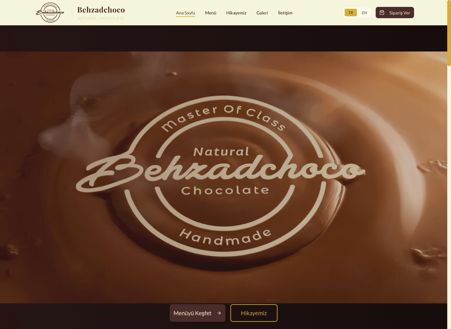
Material / 03
When the interface steps back, the product texture leads.
The digital direction does not explain chocolate, packaging, and the working shop. It lets those materials become the surface.
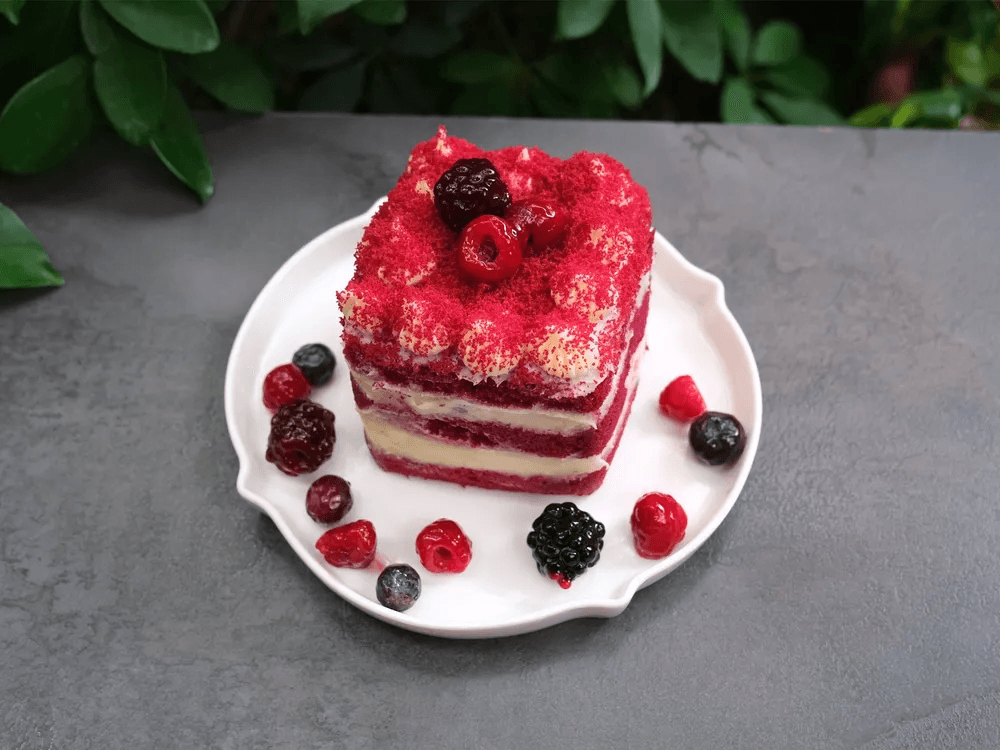
Product photography is not decoration. It is the beginning of the visual hierarchy.
Material / interface / delivery
From material to live delivery.
Product, founder story, menu, and interface carry one tone through a single digital delivery.
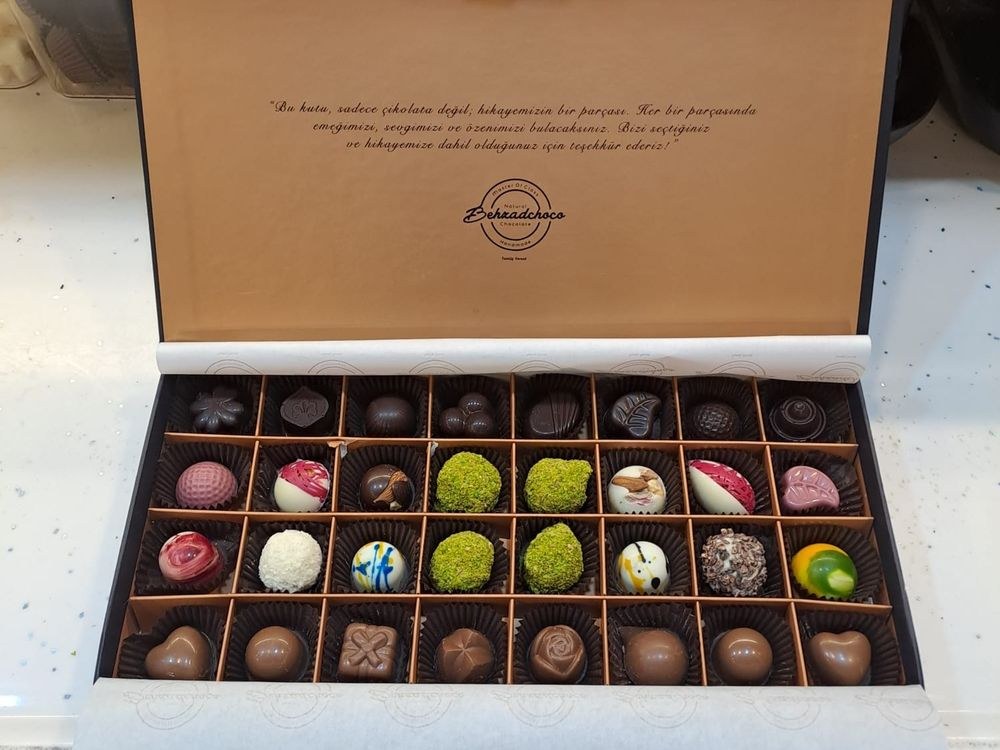
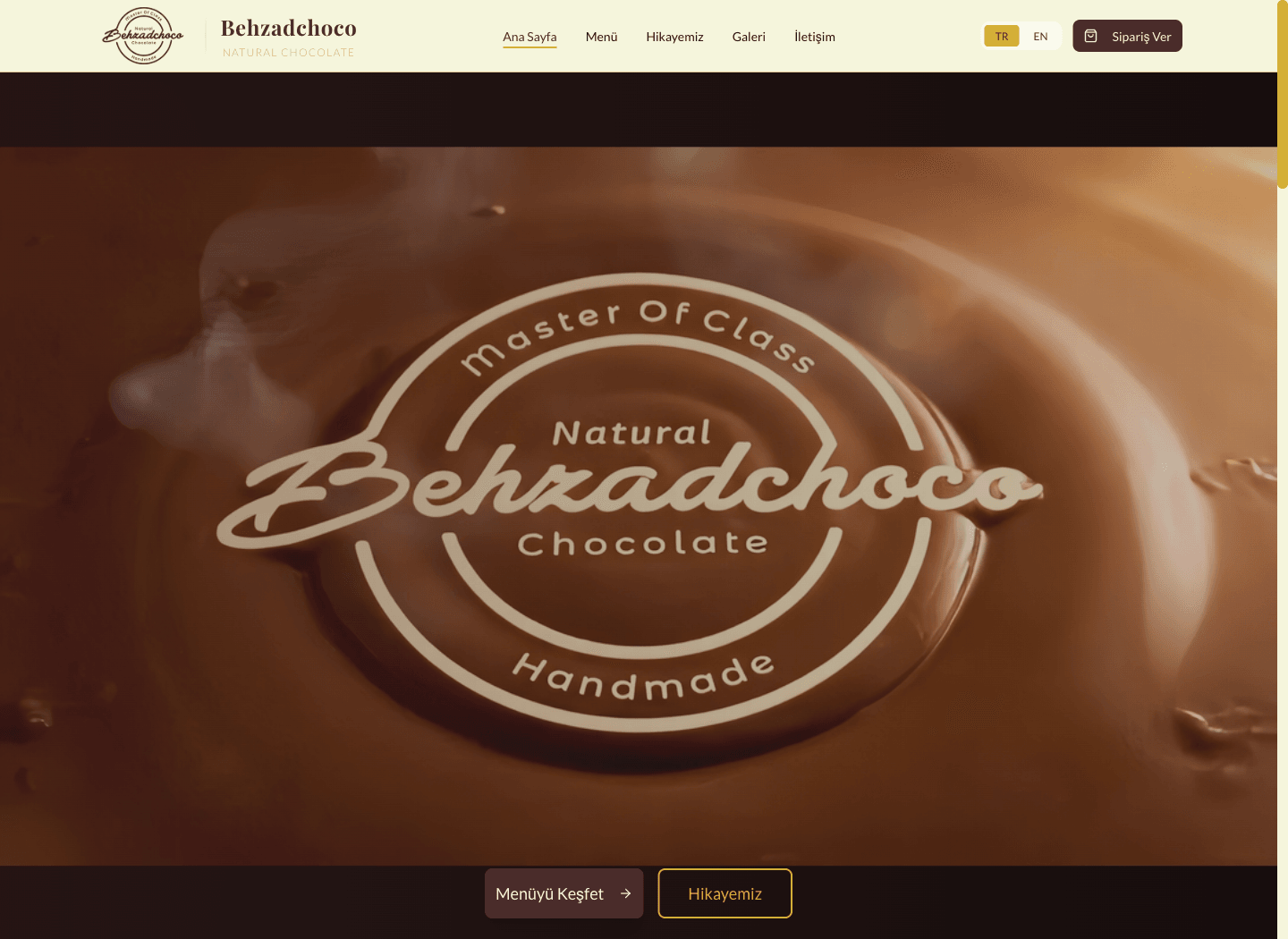
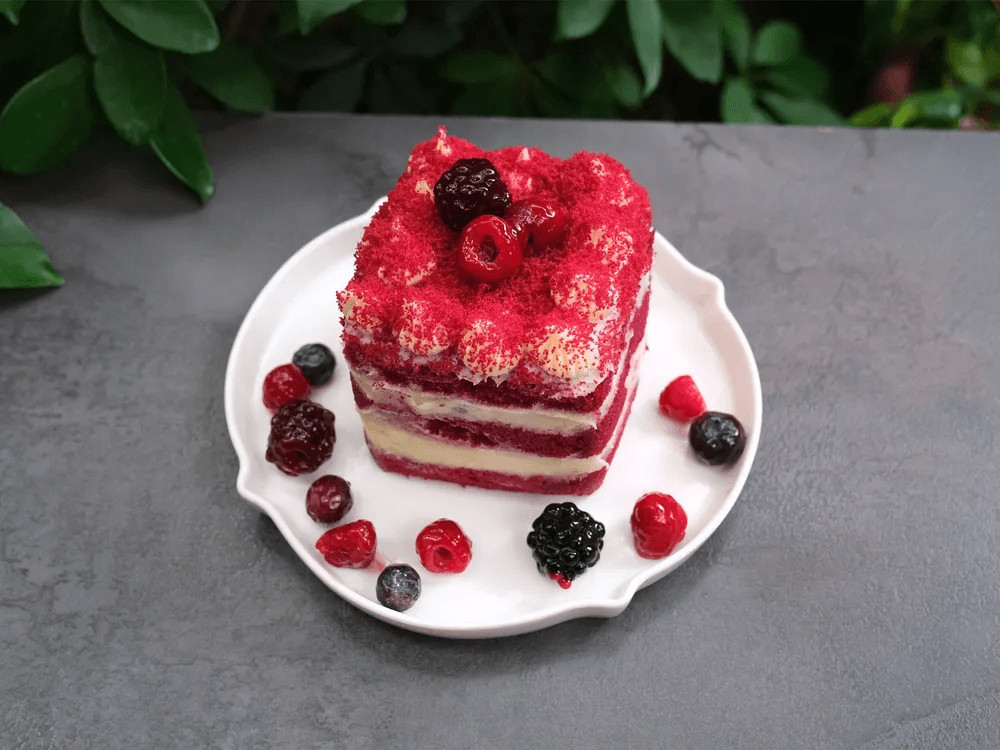
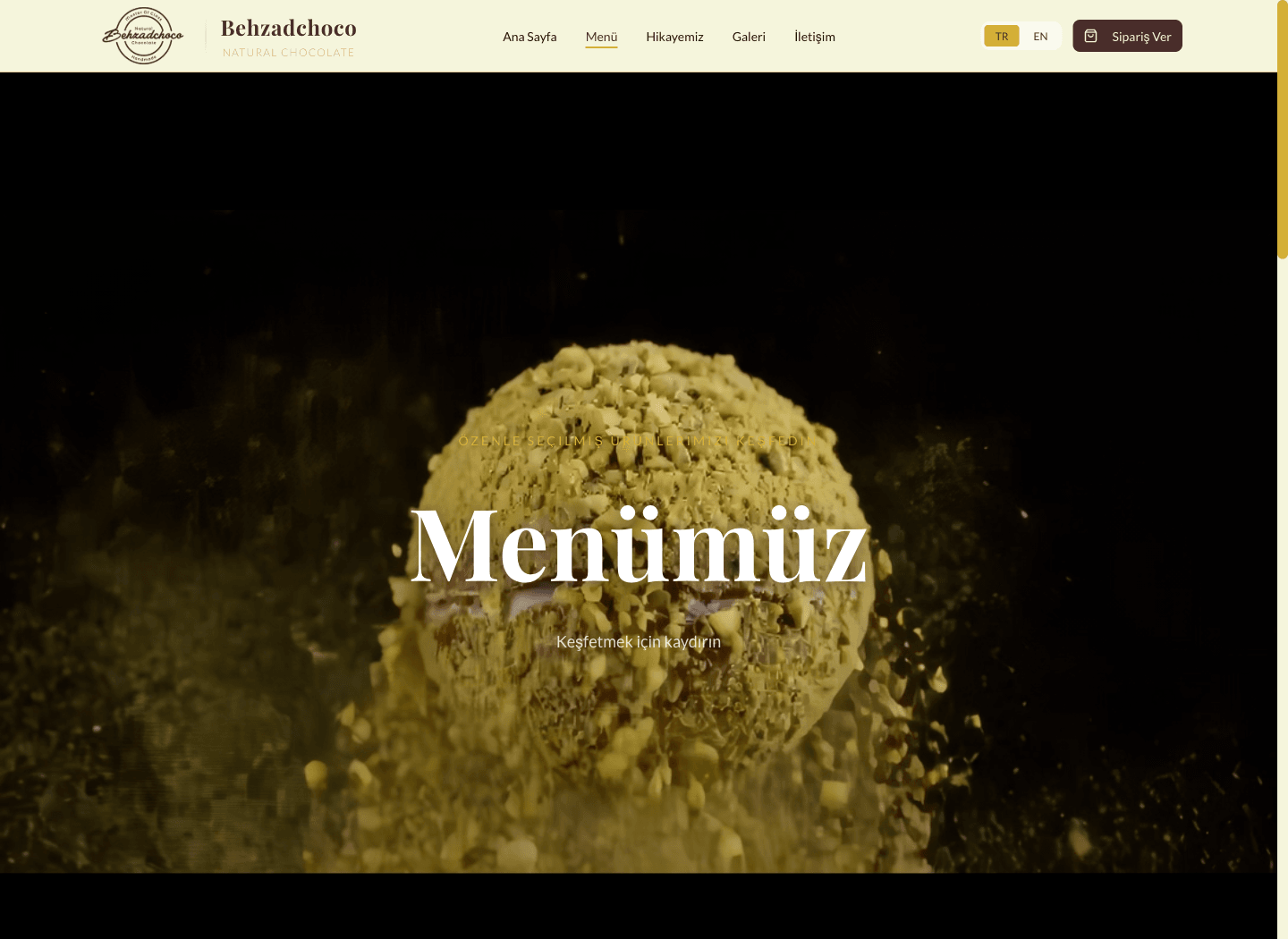
The material had to lead.
Behzadchoco already had the strongest possible visual language: chocolate, process, packaging, and the atmosphere of a working shop. The website direction therefore avoids explaining the brand with generic hospitality patterns. Product photography and interface become the primary surface; navigation and copy support them.
The project covered the digital direction, responsive UX/UI, React/Vite implementation, bilingual content structure, menu and gallery behavior, and production delivery.
A catalogue that behaves like an editorial collection.
Products span chocolate boxes, individual pieces, desserts, drinks, and seasonal items. The experience groups that depth into a visual menu without pretending to be a checkout. Visitors can move from product discovery into story, gallery, contact, and ordering channels without losing the brand atmosphere.
Motion is used to preserve continuity between these moments, not to hide loading or make routine controls theatrical.
Live work includes imperfect constraints.
The current website is a real client delivery and its implementation is React/Vite—not Next.js. Media weight, mobile cropping, semantic structure, and performance remain measurable areas for iteration. The case study presents the work as it exists rather than rewriting it as a frictionless launch story.
Content system
Two languages, real product depth, and a live client delivery remain inside one editorial structure.
- 01Product-led landing
- 02Visual menu
- 03Story and gallery
- 04Contact / order channel
- React
- Vite
- TypeScript
- Responsive media
- Bilingual content
- Delivery scope
- TR/EN
- Bilingual experience
- LIVE
- Client delivery
- 269
- Product records in the current bundle
Boundary
Where the claim stops
This is a live React/Vite client website. It is a product catalogue and brand experience, not an e-commerce checkout, and no sales or conversion claims are made.